Project Info
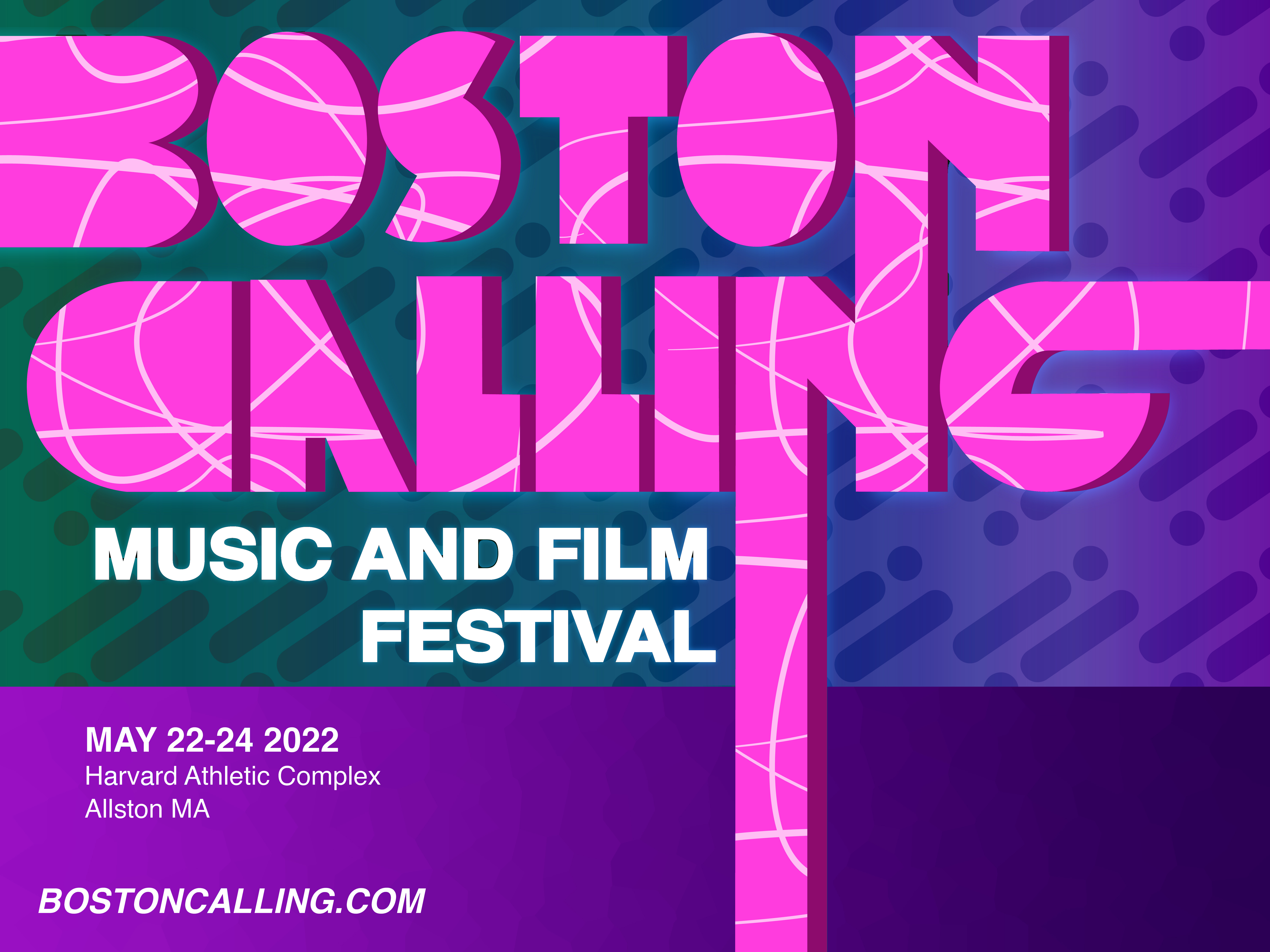
This poster is all about typography. The letterforms in the logo are simplified to omit the counters in order to accentuate the silloute of the letterforms. As a result the shape of the letters is emphasized which makes them bolder, allowing them to dominate the composition. Additionally the extenstions of the stems of some the letters amplify the effect. The information is secondary and is the last thing the viewer will notice, however the preceding charecteristics of the poster make it attention grabbing, meaning the information will still be read by anyone curious enough to stop and look.
